A 5-Step Guide To Understanding Letterpress Printing
Letterpress printing is similar to the personalization we do here, which we refer to as embossing:

In a post from Creative Bloq they give a great explanation about letterpress printing and a 5-Step guide so that you can implement it for your own use.
"The printing press and moveable type, invented by Johannes Gutenberg in the 15th Century, brought a revolution in mass distribution of the written (or printed) word, and consequently in literacy among common people. For nearly 500 years there wasn’t anything superior to the same basic design, before eventually modern lithographic offset printing supplanted the technology, and letterpress became a dying art. In recent years, its popularity has increased again as artisan printers and designers collaborate to create individual, short-run pieces that exhibit a more tactile, high-quality finish than possible with a litho-produced print.
Here we explain the basics of letterpress printing and offer some tips to help you get started with your own letterpress projects...
1. What distinguishes letterpress prints

Matthew Del Degan used a blind print, with no ink, to achieve a simple, clean letterpress print.
Letterpress prints tend to have a very tactile quality, with a slight debossing effect evident where the ink has been laid. Occasionally letterpress also combines blind debossing, where a plate is made and used without ink purely for its debossing effect. As the process is very manual, letterpress prints tend to also be as much about the paper stock as the print itself, with the printer and designer working together to choose unusual, richly textured or heavyweight stocks.
2. How letterpress works
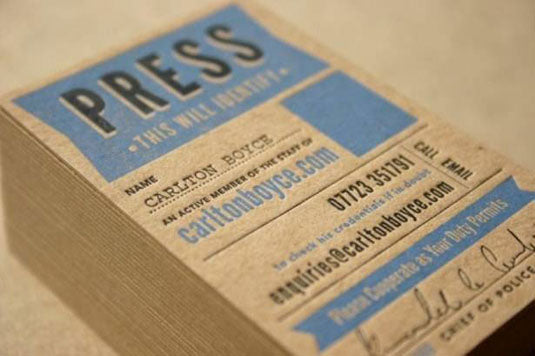
CarltonBoyce created these unique business cards, which are memorable for their design approach. The choice of recycled-looking card stock supports the aesthetic.
Traditionally, letterpress printing involved arranging individual blocks of 'moveable type' into a caddy, forming words from the combination of letters. As this type was used to make the print, all the characters were moulded in reverse, and the words had to be similarly arranged in reverse. Images could be included in letterpress prints, but needed to be etched in either wood or metal, making it a time-consuming process.
Many of the typography terms and phrases we’re now familiar with originate from the combination of moveable type and the letterpress process. 'Upper case' and 'lower case', for example, refers to the storage of the different type forms in type cases. 'Leading', the space between two lines of type, refers to strips of lead placed between lines of moveable type to space them further apart.

This simple script design is printed onto two-ply board. The print colour matches the red board, providing a coherent design aesthetic overall. GFSmith produce a range of two-ply board that is perfectly suited to this kind of letterpress work.
The finished print surface, constructed from moveable type and image plates, is inked before being applied with pressure to the surface being printed. This results in a clean, sharp imprint, and dependent upon the amount of pressure applied during the print, along with the material being printed onto, a physical debossing impression will be made simultaneously. This debossing impression is part of the appeal of letterpress print, as it adds to the tactile nature of the printed piece.

This simple design approach also uses bonded board to achieve a clean but memorable result, and demonstrates that less can often be more when it comes to letterpress printing.
Thankfully, in the 20th century a new process was invented whereby text and graphics could be produced onto a flexible relief plate, providing the necessary difference in height to create the same clean print possible with moveable type and etched images, but produced using photo-sensitive chemicals and light. These plates are called photopolymer plates, and are what modern printers use to create letterpress plates from your digital artwork.
3. How to create letterpress artwork
Creating your own letterpress artwork is quite straightforward. Working in Illustrator or InDesign is ideal, and artwork can be prepared in the same way you’d prepare any other work for print. There are a few simple rules to follow for the best results:
Don’t use transparency

Tonal variation is best achieved using half-tone patterns or similar - variable opacity doesn’t work with letterpress
There isn’t an option to lay down less ink in one area than in another - letterpress prints are all or nothing - so avoid reducing the opacity of your primary colours. If you want to achieve a lighter result, consider using a half-tone pattern to reduce the ink density in that area.
Minimise your colours

Avoid using more than two or three colours. Each colour adds to the cost of printing!
Each colour needs to be printed individually on letterpress, and the process doesn’t suit the familiar CMYK blended colour approach. Consequently, you need to consider letterpress as being a series of spot colours - try to avoid overlapping colours where possible, as this will create inconsistencies during the printing process. As each colour requires a separate plate to be created, you should also try to stick to a maximum of two or three colours overall. Ask your printer for advice if you need to use more colours.
Consider resolution

Avoid fonts with fine details such as the cross bars on this font from Conqueror
The resolution of a piece of artwork is important when using letterpress as very fine details may be lost during the printing process. Different printers will have different tolerances, so ask your printer for the minimum detail area size that they can support. Some fonts have lines that are too fine for effective letterpress printing, so try to avoid these in your design.
Output as spots

Use spot colours to help your printer create the plates for your artwork
As your printer will need to create separate plates for each colour, they’ll need you to output the artwork in colour separations. This is easiest to achieve by setting your main colours up as spot colours inside your authoring software. In Illustrator you can do this by creating a new swatch and choosing 'spot' as the colour type.
4. Getting your letterpress printed

This business card for a tattoo parlour in Portland uses negative space cleverly to create the impression of three-colour print, while only using two.
There are quite a few commercial letterpress printers in the USA and UK, so look for one close by that you can visit and see the process for yourself. If you prefer to get hands-on, many colleges are starting to teach letterpress as evening classes, or you can buy some basic materials and create a home press relatively inexpensively. Check eBay for starter kits!
5. Further reading

Graham Jones shows how to gain beautiful results from letterpress printing.
Want to learn more about letterpress printing, and start getting your hands dirty? Then check out these great tutorials...
Design and produce a letterpress print
Graham Jones shows how to gain beautiful results from this old craft.
Master the art of letterpress
From initial sketches to platemaking, designer and printmaker David Huyck walks you through how to create a letterpress print.
Introducing LetterMpress
A look at the app, available for Mac and iPad, which puts you in control of a virtual letterpress press."
(Via Creative Bloq)